Stop scrolling. Start knowing. This isn’t another style quiz—it’s a compassionate, step-by-step journey to uncover the design language that already lives within you.
You’ve saved countless Pinterest pins. You’ve lingered in spaces that felt inexplicably right, then returned home to an environment that leaves you unsettled. This isn’t indecision. It isn’t a lack of taste. It’s the result of an industry that sells finished aesthetics instead of teaching foundational literacy. True design alignment emerges when your surroundings reflect your emotional needs, daily rhythms, and the unique character of your space. Through a structured framework grounded in environmental psychology and practical design principles, you’ll cultivate a home that feels authentically, peacefully, and intentionally yours. No prior design knowledge required—only curiosity and a willingness to listen deeply.
Introduction: Why “Finding Your Style” Feels So Hard (And Why It Shouldn’t)
Walk into any major furniture retailer, and you encounter curated illusions: the “Modern Farmhouse” vignette beside the “Coastal Grandmillennial” display, each presented as a complete, ready-to-buy identity. Social media algorithms amplify this fragmentation, serving hyper-specific aesthetics until your mental catalog feels like a tangled necklace of incompatible charms. The result? Decision paralysis. Guilt over “mixing styles.” Anxiety that your choices won’t be “correct.” This exhaustion isn’t your fault—it’s a symptom of a system prioritizing consumption over connection.
Environmental psychology research consistently indicates that spaces reflecting personal values and emotional needs can significantly support reduced stress and increased feelings of restoration. Your longing for a cohesive aesthetic isn’t superficial—it’s a deeply human need for environmental congruence. This guide reframes the entire quest. We’re not hunting for a label to paste onto your walls. We’re embarking on a gentle excavation of your sensory preferences, lifestyle rhythms, spatial realities, and emotional non-negotiables. The destination isn’t a magazine-perfect room—it’s the quiet confidence of walking into a space that whispers, “You are understood here.” This process honors complexity. It welcomes contradiction. It makes room for craving minimalist calm in your bedroom while embracing vibrant, collected energy in your kitchen. Authenticity isn’t about purity—it’s about intentionality. Let’s begin.
The Style DNA Framework: Four Layers to Uncover Your True Design Language
Forget personality quizzes with arbitrary results. True design alignment emerges from the intersection of four tangible, observable layers. This framework—developed from established principles in environmental psychology, spatial anthropology, and residential design patterns—provides a structured yet flexible path to clarity. Work through each layer sequentially. Resist the urge to jump ahead. The magic happens in the connections between the layers. Keep a dedicated journal (digital or physical) for this process. Date each entry. Your reflections are valuable data.
Layer 1: The Emotional Audit — What Does Your Space Need to Feel Like?
Before considering a single color swatch or furniture piece, define the emotional atmosphere you require. A home is not a museum; it’s an emotional ecosystem. How should entering your front door make you feel? What sensation should greet you at dawn? This layer bypasses visual trends entirely and targets the nervous system.
Why This Layer is Non-Negotiable:
Choosing furniture based solely on appearance is like selecting a partner based solely on a photograph. You might admire the surface, but without emotional compatibility, the relationship feels hollow. A space designed for “calm” requires fundamentally different choices than one designed for “energetic connection”—even with similar colors. Misalignment here causes the subtle, persistent unease many feel in beautifully decorated but emotionally mismatched homes.
How to Conduct Your Emotional Audit (Step-by-Step):
1. The Memory Mine: Close your eyes. Recall three places (not necessarily homes) where you felt profoundly at peace. A library nook? A lakeside dock at dawn? Your grandmother’s sun-drenched kitchen? For each:
* Sensory Snapshot: What did you see, hear, smell, feel physically? (e.g., “Warm wood under bare feet,” “Sound of rain on a tin roof,” “Smell of old paper”)
* Emotional Essence: What single word captures the core feeling? (e.g., “Sanctuary,” “Nourishment,” “Belonging”)
* Physical Response: Did your shoulders drop? Did you breathe deeper?
2. The Antithesis Exercise: Recall three places where you felt uncomfortable or drained. A sterile corporate lobby? A cluttered store? Identify specific sensory triggers and the resulting emotional state (“anxious,” “overwhelmed”).
3. The Daily Rhythm Check: Map your ideal emotional journey through a typical day:
* Morning (6-9 AM): What feeling supports your start? (Gentle awakening? Efficient readiness?)
* Evening Return (5-7 PM): What feeling aids transition from work to home? (Decompression? Warm welcome?)
* Wind-Down (9-11 PM): What feeling prepares you for rest? (Deep calm? Intimate connection?)
4. Synthesize Your Top 3 Emotional Anchors: From your notes, distill three critical, non-negotiable feelings. Avoid vague terms like “nice.” Choose words with emotional weight: Sanctuary, Clarity, Warmth, Inspiration, Groundedness, Joyful Connection. Write them prominently in your journal. These are your compass.
The Fundamental Principle: Your emotional anchors are the non-negotiable foundation. Every subsequent design decision—color, texture, layout, object—must be evaluated against this question: “Does this choice actively support my top three emotional anchors?” If not, it is decoration, not design.
Common Pitfalls & Gentle Corrections:
Pitfall: “I want my home to feel like a luxury hotel lobby.”
Correction: Hotel lobbies prioritize transient impressiveness, not daily living. Dig deeper: What feeling does that lobby evoke? “Polished calm”? Translate that feeling residentially: smooth linen textures instead of cold marble, warm ambient lighting instead of dramatic spotlights, personal objects that tell your story.
Pitfall: Confusing “calm” with “boring” or “minimal.”
Correction: Calm is deeply personal. For some, calm is empty white walls. For others, calm is the rich texture of a well-loved library. Your Emotional Audit defines your calm. Honor it without judgment.
Pitfall: Ignoring sensory triggers from your Antithesis Exercise.
Correction:* If fluorescent lighting caused anxiety, consciously choose warm, dimmable LED sources (2700K-3000K) throughout your home. This is proactive emotional design.
Layer 2: The Lifestyle Lens — Designing for the Life You Actually Live
This layer confronts the gap between aspiration and reality. We’ve all seen the pristine, all-white kitchen online—then imagined making pancakes with a toddler. Design ignoring daily rhythms becomes a source of friction. Your lifestyle isn’t a constraint; it’s the fuel for authentic, functional beauty.
Why This Layer is Non-Negotiable:
A space fighting your habits creates daily stress. A space flowing with your habits feels intuitive and supportive. Designing for your real life builds trust between you and your environment.
Mapping Your Authentic Lifestyle (Be Brutally Honest):
Grab your journal. Answer these prompts with raw honesty—no judgment.
- The People & Pets Inventory:
- Who truly uses this space daily? (Include ages, mobility considerations, sensory sensitivities)
- Pets? Breed, size, shedding level, favorite resting spots?
- How often do guests stay overnight?
- The Daily Flow Deep Dive (Room by Room):
- Kitchen: “On a typical Tuesday, I…” (e.g., “rush to pack lunches,” “cook while listening to podcasts”). What surfaces get used most? Where do keys/mail land?
- Living Room: “Evenings usually involve…” (e.g., “family movie nights,” “quiet reading”). Where do bodies gather? Where do remotes live?
- Entryway: “The first 60 seconds after walking in look like…” (e.g., “shoes kicked off,” “backpacks dropped”). What creates the biggest bottleneck?
- Bedroom: “My wind-down ritual includes…” (e.g., “reading in bed,” “laying out tomorrow’s clothes”). What disrupts sleep?
- The “Friction Point” Audit:
List top 5 recurring frustrations:- “I trip over the dog’s water bowl near the kitchen door.”
- “There’s nowhere to put my laptop when paying bills.”
- “The hallway light switch is too far from the bed.”
- The Joyful Ritual Spotlight:
Identify 3-5 small, recurring activities bringing genuine joy. How can your space celebrate these?- “Morning coffee on the balcony” → Needs a small weather-resistant table, hook for the mug.
- “Weekly board game nights” → Needs flexible seating, good task lighting, hidden storage.
- “Watering plants every Sunday” → Needs designated spot for watering can, easy sink access.
Translating Lifestyle into Design Intelligence:
Your answers are your most valuable design brief.
- If your friction point is “cluttered entryway”: Solution isn’t just “buy a console table.” It’s: “A narrow bench (14” deep) with open cubbies underneath for shoes, a shallow tray on top for keys/mail, wall-mounted hooks at varying heights for bags and leashes. Material must be wipeable.”
- If your joyful ritual is “reading in bed”: Solution isn’t just “add a lamp.” It’s: “Wall-mounted swing-arm sconces on both sides of the bed (frees nightstand space), fabric shades to diffuse light softly, accessible outlets behind the headboard.”
- If you have young children or pets: “Durability” isn’t hiding personality. It’s smart material choices: Performance fabric (Crypton, Sunbrella) on sofas in rich, forgiving colors (charcoal, olive); area rugs with low pile or flatweaves; rounded furniture corners; accessible storage teaching ownership while containing chaos.
The Aspiration vs. Reality Bridge:
Do you wish you cooked gourmet meals nightly but realistically order takeout three times a week? Honor reality while planting seeds for aspiration. Design the kitchen for efficient takeout unpacking and cleanup (ample counter space near sink, dedicated recycling spot), but include one intentional element supporting aspiration: a visible knife block, a small windowsill herb garden. This reduces guilt and makes aspiration feel achievable. Your home should meet you where you are today, while gently encouraging growth.
Layer 3: The Space Reality Check — Working With Your Architecture, Not Against It
This is where well-intentioned efforts often derail. Falling in love with “Scandinavian minimalist” while living in a 1920s Craftsman bungalow with dark wood beams creates visual tension. True mastery lies in harmonizing your desired atmosphere (Layer 1) and lifestyle needs (Layer 2) with your home’s inherent character.
Why This Layer is Non-Negotiable:
Fighting your architecture is exhausting and unsatisfying. Embracing it unlocks unique character, authenticity, and often cost savings. Your home’s era, structure, light patterns, and quirks aren’t flaws—they’re the canvas. The goal is respectful dialogue.
Conducting Your Space Reality Assessment (Room by Room):
Grab your phone (for photos) and a measuring tape. Be an objective observer.
- Architectural Era & Character Clues:
- Exterior: Research your home’s architectural style. Note roofline, window shapes, siding.
- Interior Bones:
- Trim & Millwork: Crown molding? Baseboard height? Casing style?
- Floors: Hardwood (species, width, stain)? Tile? Condition?
- Walls: Plaster? Drywall? Texture?
- Ceilings: Height? Beams? Sloped?
- Windows & Doors: Shape? Size? Placement? Original hardware?
- Fireplace: Style? Mantel material?
- Take clear photos of these details. They are your home’s fingerprint.
- The Light Map (Critical!):
- Track sunlight over one full day. Note:
- Which rooms get morning sun? (East-facing: cool, gentle light)
- Which get harsh afternoon sun? (West-facing: warm, intense—requires mitigation)
- Which are north-facing? (Consistent, cool light—ideal for art)
- Which are south-facing? (Bright, warm light all day)
- Window size and obstruction (trees, buildings)?
- Why it matters: Light dictates color perception, plant viability, furniture placement, and mood. A color serene in a north room may feel cold; the same color in a south room may feel vibrant. Seasonal shifts matter too—winter light differs significantly from summer.
- Track sunlight over one full day. Note:
- Spatial Constraints & Opportunities:
- Measurements: Precise room dimensions, window/door locations, ceiling height. Sketch a simple floor plan.
- Flow: How do you move through the space? Where are natural pathways? Bottlenecks?
- Quirks: Embrace them! A slanted wall? An oddly placed column? These are opportunities for unique solutions—not problems to hide.
- Existing Elements You Must Keep (For Now):
Be pragmatic. List non-negotiables due to budget, structure, or sentiment:- “Original oak floors are scratched but loved; refinishing is future.”
- “Pink-tiled bathroom is functional; renovation is years away.”
- “Large built-in bookshelf is structural.”
- “Inherited antique dining table.”
- This list is strategic—it defines your starting point.
Harmonizing Your Vision with Reality: A Practical Translation Guide
| If Your Home Has… | And Your Emotional Anchor is “Calm” | And Your Lifestyle Needs “Family Function” | THEN Your Design Strategy Should… | Avoid… |
|---|---|---|---|---|
| Dark Wood Trim (Craftsman, Victorian) | Use deep, earthy neutrals (charcoal, olive, warm taupe) on walls to complement the wood. Add textured cream/ivory textiles to soften. | Choose durable, medium-tone performance fabrics bridging wood tone and wall color. Incorporate accessible storage within the room’s footprint. | Celebrate craftsmanship. Highlight trim with subtle uplighting. Use wood as anchor for a warm, grounded palette. | Painting all trim stark white (creates conflict), very light/bright wall colors clashing with wood’s warmth. |
| Low Ceilings (Ranch, Basement) | Use vertical lines: floor-to-ceiling curtains, tall narrow art, vertical striped rugs. Keep wall colors light and consistent. | Prioritize low-profile furniture (sofas with exposed legs) to maintain sightlines. Use multi-functional furniture (storage ottomans). | Embrace coziness! “Calm” here can be “nest-like” sanctuary. Use warm, layered lighting (multiple sources at different heights). | Tall, bulky furniture blocking sightlines; dark ceiling colors; heavy floor-length drapes stopping at window frame. |
| Abundant Natural Light (South/West Facing) | Use light-filtering treatments (linen roller shades, sheer curtains) to soften glare. Choose colors with subtle depth (not pure white). | Select fade-resistant fabrics near windows. Incorporate reflective surfaces (light wood, subtle metallics) to bounce light deeper. | Harness the light! Position reading nooks, plant collections, or art displays to benefit. Use light to enhance textures (woven baskets, wool throws). | Heavy blackout curtains as only option; very dark walls absorbing all light; ignoring UV protection for furniture/art. |
| Open Concept Layout | Define “zones” (living, dining, kitchen) using area rugs, lighting changes, furniture arrangement for psychological boundaries. | Ensure sightlines support supervision (e.g., kitchen sink facing living area). Use furniture with open bases to maintain flow. Partial-height shelving provides separation without closing off. | Create intentional transitions. Use a consistent color thread (e.g., same wood tone, repeated accent color) to unify while allowing zone character. | Placing all furniture against walls (cavernous feel); wildly different color schemes per zone (disjointed); ignoring acoustics (add textiles, rugs). |
The Power of “Yes, And…”:
Your home has character. Your desires are valid. The solution is rarely “either/or.” It’s “yes, and.”
Yes, my 1970s ranch has avocado-green bathroom fixtures I can’t change yet, AND I can create a serene sanctuary around them. → Strategy: Paint walls a warm terracotta or muted sage complementing the green. Use natural textures (jute rug, teak stool, linen shower curtain). Add black matte hardware accents. Introduce humidity-loving plants. The green becomes an intentional vintage accent.
Yes, my apartment has builder-grade beige carpet, AND I can create a vibrant space. → Strategy: Layer large, colorful area rugs (flatweave for easy cleaning) to define zones. Use bold wall colors or removable wallpaper on accent walls. Focus decorative energy upward—art, lighting, window treatments. The carpet becomes a neutral base you’ve intentionally layered over.
This mindset shift—from frustration to creative collaboration—is liberating. You are not stuck; you are strategically resourceful.
Layer 4: The Style Synthesis — Weaving It All Together Into Your Unique Language
You now hold the threads: Emotional Anchors (Layer 1), Lifestyle Blueprint (Layer 2), Space Reality (Layer 3). Layer 4 is the gentle art of weaving them into a cohesive, personalized design language. Forget rigid labels. We’re creating a palette of principles.
The Synthesis Process:
1. Review Your Journal: Spread out notes from Layers 1-3. Look for natural connections.
* Example Pattern: Emotional Anchor = “Grounded Sanctuary”; Lifestyle = “Loves cooking, has a dog, needs durable surfaces”; Space = “1940s brick bungalow, north-facing living room, original hardwood floors.”
* Emerging Threads: Warmth (to counter north light), natural materials, earthy colors, durable textures, honoring original details.
2. Identify Core Style Influences (Not Labels!): Based on threads, which aspects of established styles resonate? Pick 2-4 key influences.
* From example: Japanese Wabi-Sabi (appreciation of natural materials, tranquility) + Modern Rustic (warm wood tones, textured textiles) + Scandinavian Hygge (coziness, functional simplicity).
* Crucially: You are not “doing Japanese Wabi-Sabi.” You are borrowing its principles: using existing hardwood floors as focal point, choosing a sofa in nubby undyed wool, placing a single handmade ceramic vase on the mantel.
3. Define Your Personal Style Palette: Create three simple lists:
* Non-Negotiables (From Layers 1-3): “Warm wood tones,” “Layered lighting,” “Durable, textured fabrics,” “Honors original trim.”
* Key Materials & Textures: “Reclaimed oak,” “Hand-thrown pottery,” “Linen,” “Wool,” “Matte black metal.”
* Color Philosophy (NOT strict palette): “Earthy neutrals as base (warm whites, taupes), with nature-inspired accents (forest green, terracotta). Avoids pure white and cool greys.”
4. Create Your “Style Compass” Statement: Write one sentence capturing your synthesized direction. This is your filter.
* Example: “My home embraces warm, grounded simplicity through natural materials, layered textures, and intentional negative space, creating a durable sanctuary that honors its historic bones and supports joyful, messy living.”
* Test it: Before buying anything, ask: “Does this align with my Style Compass statement?” If yes, it belongs. If no, thank it and move on.
Why Synthesis Beats Style Hunting:
Rigid adherence to a single style often leads to:
Inauthenticity: Forcing elements that don’t serve emotional or lifestyle needs (“I should have an Eames chair, even though it’s uncomfortable”).
Stagnation: Feeling trapped unable to incorporate beloved heirlooms.
Cost: Chasing specific iconic pieces.
Synthesis empowers you:
Flexibility: Your compass guides while allowing evolution. A vintage kilim rug fits if it aligns with your “textured, earthy” philosophy.
Uniqueness: Your combination of influences is inherently yours.
Confidence: Decisions become easier. You’re not asking “Is this Mid-Century?” but “Does this feel warm, grounded, and textural?”
Budget-Friendly: Focus on qualities* (material, texture, proportion) rather than brand names or era-specific silhouettes. Thrift stores, IKEA, and local artisans become treasure troves.
The “Style Spectrum” Exercise:
Draw a horizontal line. Label left end “Minimalist / Calm” and right end “Maximalist / Vibrant.” Place a dot where you genuinely fall. Be honest. Most people aren’t at extremes.
Left of center: Prioritizes clean lines, negative space, restrained palette. Clutter is enemy.
Right of center: Thrives on layered patterns, collected objects, rich colors. Empty space feels cold.
Near center (most common): Seeks curated abundance. Needs negative space to breathe but craves personality. Challenge is intentional editing: “Does this object spark joy and serve my anchor?”
This spectrum isn’t judgment—it’s a diagnostic tool. It explains why a “minimalist” tip might feel oppressive, or why a “maximalist” room might feel chaotic. Honor your natural position. Your authentic style lives within* your spectrum zone.
Beyond the Label: Deep Dive into 12 Core Design Styles (As Tools, Not Rules)
Understanding established styles provides vocabulary and reveals timeless principles you can borrow. Think of this as a library of ideas—not a menu. Read each through your Style DNA lens. Which elements resonate with your anchors, lifestyle, and space? Which feel alien? Take notes. This is research, not prescription.
1. Scandinavian (Hygge-Inspired)
- Core Philosophy: Democratic design for everyday life. Prioritizes light, function, warmth, and human connection (“hygge” = cozy contentment). Born from long winters—maximizing light and comfort is essential.
- Key Identifiers: Light wood floors (pine, ash), white or pale walls, functional furniture with clean lines, abundant textiles (chunky knits, sheepskins), organic shapes, layered lighting (pendants, floor lamps, candles). Nature indoors (simple branches, hardy plants).
- Emotional Anchor Match: Calm, Clarity, Warmth, Connection.
- Lifestyle Fit: Ideal for valuing simplicity, ease of cleaning, inviting gathering spaces. Less ideal for collectors of dark, heavy antiques.
- Space Reality Tip: Essential in north-facing or low-light rooms. Light palette amplifies available light. In sunny south rooms, balance with deeper wood tones or textured walls to avoid sterility. Seasonal note: In winter months, layer additional textiles and warm lighting to maintain hygge.
- Borrow This Principle: “Light is a material.” Prioritize multiple, warm light sources at varying heights over one central overhead light. Universally applicable.
- Common Misstep: Mistaking it for cold minimalism. True Scandinavian design is warm minimalism—texture is everything. A room with white walls and white sofa feels empty; add cream wool throw, light oak table, jute rug, pendant cluster, and it becomes hygge.
- Your Synthesis Question: “Does incorporating light woods and layered lighting support my need for [Your Anchor] in my [Your Space]?”
2. Japanese Wabi-Sabi
- Core Philosophy: Finding beauty in imperfection, impermanence, and incompleteness. Celebrates marks of time, natural processes, humble materials. Deeply connected to mindfulness.
- Key Identifiers: Asymmetry, raw natural materials (unvarnished wood, rough clay, stone, paper), muted earthy palette (charcoal, clay, moss green), intentional negative space (“ma”), handmade objects with visible flaws, connection to nature (single branch in vase). Low furniture.
- Emotional Anchor Match: Sanctuary, Groundedness, Mindfulness, Simplicity.
- Lifestyle Fit: Ideal for seeking calm, reducing visual noise, valuing intentionality. Requires mindset shift away from “perfect.” Less ideal for high-energy households thriving on visual stimulation (though elements can be incorporated).
- Space Reality Tip: Works beautifully in small spaces by emphasizing quality over quantity. Honors original architectural details like exposed beams—see them as wabi-sabi features. In humid climates, choose materials resistant to moisture damage.
- Borrow This Principle: “Edit to reveal essence.” Before adding anything, ask: “What can I remove to make remaining elements more meaningful?” Applies to decluttering any space.
- Common Misstep: Creating a sterile, empty room. True wabi-sabi is warm and textured. It’s the crack in pottery repaired with gold (kintsugi), not a blank white wall. It’s about the story an object tells.
- Your Synthesis Question: “How can I honor natural materials in my home and incorporate intentional pauses to support my need for calm?”
3. Modern Farmhouse
- Core Philosophy: Blending rustic agricultural charm with contemporary clean lines and comforts. Evokes nostalgia, warmth, approachable simplicity. Focus on gathering and nourishment.
- Key Identifiers: Shiplap or board-and-batten walls (real or faux), black matte fixtures, apron-front sink, open shelving, mix of wood tones, neutral palette (whites, creams, greys, black accents), vintage-inspired elements, comfortable upholstery.
- Emotional Anchor Match: Warmth, Nostalgia, Connection, Comfort.
- Lifestyle Fit: Excellent for families cooking and gathering in kitchen. Open shelving requires commitment to tidy presentation. Durable fabrics key.
- Space Reality Tip: Can feel overwhelming in very small apartments. Scale down: shiplap only on accent wall; one statement black fixture. In modern boxy apartment, rustic elements add crucial warmth. In regions with high humidity, ensure wood elements are properly sealed.
- Borrow This Principle: “Mix old and new.” Pair sleek modern sofa with reclaimed wood coffee table. Creates visual interest and tells a story. Universally applicable.
- Common Misstep: Overdoing clichés (excessive shiplap, galvanized metal). Authenticity comes from meaningful vintage pieces or high-quality reproductions used sparingly.
- Your Synthesis Question: “Which specific elements genuinely support my lifestyle and emotional needs, versus which feel like trend-chasing?”
4. Mid-Century Modern (MCM)
- Core Philosophy: Form follows function. Optimism, innovation, connection to outdoors (post-WWII era). Clean lines, organic curves, honest materials.
- Key Identifiers: Tapered furniture legs, organic shapes (kidney bean tables), indoor/outdoor integration (large windows), bold accent colors against neutrals (mustard, teal), materials (molded plastic, plywood), starburst mirrors, geometric patterns.
- Emotional Anchor Match: Clarity, Optimism, Creativity, Connection to Nature.
- Lifestyle Fit: Great for appreciating iconic design, clean lines easy to clean around, open airy spaces. Can feel cold if not layered with textiles and personal objects.
- Space Reality Tip: Thrives in homes with good natural light and open floor plans. In dark, compartmentalized older homes, focus on key pieces (MCM-inspired credenza) rather than full transformation. Clean lines provide visual relief in busy rooms.
- Borrow This Principle: “Let legs breathe.” Furniture with exposed legs creates lightness and airiness, making rooms feel larger. Works in almost any style.
- Common Misstep: Museum-like replica. Authentic MCM was lived-in. Layer vintage sofa with chunky knit throw and colorful pillows. Mix Eames chair with rustic wood side table.
- Your Synthesis Question: “Do clean lines and organic shapes support my need for visual clarity, and how can I soften them with texture?”
5. Bohemian (Boho)
- Core Philosophy: Eclectic, free-spirited self-expression. Rejects rules. Celebrates travel, artistry, texture, layering. Personal history paramount.
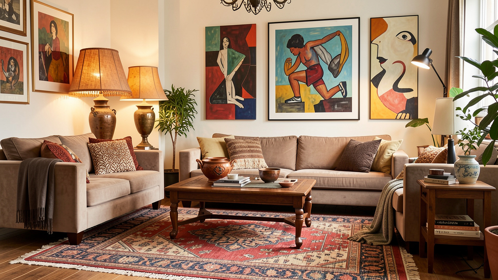
- Key Identifiers: Rich saturated colors (deep reds, purples, jewel tones), global textiles (Moroccan rugs, Indian prints), layered patterns, abundant plants (hanging/macrame), mixed eras/cultures, low seating, floor cushions, brass/gold accents, gallery walls.
- Emotional Anchor Match: Joy, Creativity, Freedom, Connection.
- Lifestyle Fit: Ideal for collectors, artists, travelers. Requires confidence to mix patterns/colors. Can be challenging for minimalism seekers or severe allergies (dust in textiles).
- Space Reality Tip: In small spaces, Boho can overwhelm. Focus on vertical layering (tapestries, hanging plants) and use unifying color thread (e.g., all textiles include terracotta). In large empty rooms, Boho’s layering adds essential warmth. In dry climates, natural fiber textiles may require extra care.
- Borrow This Principle: “Texture is color.” Even in neutral palette, layering textures (rough wood, smooth ceramic, nubby wool) creates deep visual interest. Invaluable for adding warmth without color.
- Common Misstep: Chaotic clutter. Boho is curated eclecticism. Every object should have meaning or bring joy. Edit ruthlessly. Group similar items intentionally.
- Your Synthesis Question: “How can I incorporate meaningful global textiles to support my need for [Joy] without creating visual chaos undermining my need for [Calm]?”
6. Industrial
- Core Philosophy: Raw, honest, utilitarian beauty. Celebrates building’s “bones” and repurposed materials. Inspired by converted lofts and factories.
- Key Identifiers: Exposed elements (brick, ductwork, pipes, concrete floors, beams), metal (iron, steel, black pipe), reclaimed wood, neutral palette (greys, blacks, browns, whites), utilitarian furniture, Edison bulb lighting, large open spaces.
- Emotional Anchor Match: Authenticity, Edge, Strength, Simplicity.
- Lifestyle Fit: Great for appreciating history, raw materials, unpretentious spaces. Can feel cold for those needing softness. Concrete floors require area rugs for comfort.
- Space Reality Tip: Perfect for honoring existing features in older homes (exposed brick). In standard new-build, introduce elements sparingly: black metal bed frame, reclaimed wood shelf, filament pendant lights. Avoid cheap faux finishes. In colder climates, prioritize adding warmth through textiles and layered lighting.
- Borrow This Principle: “Celebrate structure.” Instead of hiding a beam, paint it bold or wrap in reclaimed wood to make it a feature. Builds character in any space.
- Common Misstep: Cold, unwelcoming space. Counterbalance raw elements with abundant warmth: deep pile rugs, leather upholstery, warm wood tones, soft textiles, warm-toned lighting (2700K bulbs).
- Your Synthesis Question: “Which existing structural elements can I highlight for authentic character, and how will I balance them with warmth?”
7. Coastal / Nautical
- Core Philosophy: Evoking feeling of being near water—light, airy, relaxed, refreshed. Not literal ship wheels (that’s “theme”), but capturing the essence of coast.
- Key Identifiers: Light airy palette (whites, creams, soft blues, sandy beiges), natural textures (jute, sisal, rope, driftwood, linen, wicker), organic shapes, abundant natural light, subtle water references (stripes, shell collections), slipcovered furniture.
- Emotional Anchor Match: Calm, Clarity, Renewal, Simplicity.
- Lifestyle Fit: Ideal for relaxed living, easy cleanup (great for beach houses, kids, pets), serene retreat. Can feel too “beachy” or sterile if not grounded with warmth.
- Space Reality Tip: Lifesaver for dark north-facing rooms—light colors maximize light. In sunny rooms, use deeper coastal tones (navy, forest green) to avoid glare. Avoid literal nautical decor unless deeply personal (e.g., family sailing history). In humid coastal regions, choose mold/mildew-resistant materials.
- Borrow This Principle: “Let light breathe.” Use light, sheer window treatments that diffuse light softly. Keep window areas uncluttered. Enhances any space.
- Common Misstep: Themed decor overload (anchors everywhere). Authentic coastal style is subtle and textural. A single piece of driftwood speaks louder than a room full of anchors.
- Your Synthesis Question: “How can I use light palette and natural textures to support my need for calm, while incorporating deeper tones or personal objects to prevent impersonality?”
8. Traditional / Classic
- Core Philosophy: Timeless elegance, comfort, order. Rooted in European design history (Georgian, Victorian, French). Values symmetry, craftsmanship, established history.
- Key Identifiers: Symmetrical arrangements, rich wood tones (mahogany, cherry), ornate details (carved wood, crown molding, wainscoting), luxurious fabrics (velvet, silk), patterned wallpapers, antique/reproduction furniture, formal dining sets, layered window treatments, gallery walls.
- Emotional Anchor Match: Comfort, Stability, Elegance, Heritage.
- Lifestyle Fit: Ideal for formal entertaining, valuing heirlooms, appreciating craftsmanship. Can feel stuffy for very casual households. Requires maintenance (polishing wood, caring for fine fabrics).
- Space Reality Tip: Thrives in homes with existing traditional architecture (crown molding, built-ins). Honors and enhances these features. In modern box, introduce elements selectively: wingback chair, Persian rug, crystal chandelier to add warmth/history. In homes with children or pets, consider performance fabric versions of traditional upholstery.
- Borrow This Principle: “Symmetry creates calm.” Arranging two matching lamps on console, or chairs flanking fireplace, creates instant visual order and tranquility. Powerful tool in any style.
- Common Misstep: Museum-like, untouchable space. True traditional comfort is lived-in. Layer velvet sofa with chunky knit throw. Place well-loved books on coffee table. Mix antique desk with modern task lamp.
- Your Synthesis Question: “Which traditional elements support my need for stability and comfort, and how can I soften them with contemporary textures or personal objects?”
9. Rustic / Mountain Modern
- Core Philosophy: Warm, grounded connection to nature and craftsmanship. Evokes cabins, lodges—refined. Prioritizes natural materials, texture, coziness (“hygge” meets wilderness).
- Key Identifiers: Reclaimed/rough-sawn wood (beams, floors, furniture), stone (fireplaces, accent walls), leather upholstery, wool/sheepskin textiles, earthy palette (charcoal, forest green, rust, cream), antler/horn accents (sparingly), large fireplaces, connection to outdoor views.
- Emotional Anchor Match: Sanctuary, Groundedness, Warmth, Connection to Nature.
- Lifestyle Fit: Perfect for seeking refuge, loving outdoors, valuing durability. Ideal for cabins, homes with fireplaces, or creating “retreat” feel. Can feel heavy/dark in small, low-light apartments.
- Space Reality Tip: In dark room, balance heavy wood/stone with light walls (warm white, cream) and ample lighting. In bright modern space, rustic elements add crucial warmth/soul. A single reclaimed wood shelf or leather chair can anchor contemporary room. In fire-prone regions, ensure stone/fireplace elements meet safety codes.
- Borrow This Principle: “Texture tells a story.” Grain of wood, weave of wool, roughness of stone—these tactile elements create deep comfort and visual interest. Prioritize texture in every room.
- Common Misstep: Overdoing “lodge” clichés (too many antlers, heavy log furniture). Modern rustic is refined. Use one statement rustic piece (live-edge slab table) paired with clean-lined chairs. Let materials speak.
- Your Synthesis Question: “How can incorporating natural materials support my need for groundedness, and how will I balance their weight with light elements for my space’s light levels?”
10. Art Deco
- Core Philosophy: Glamorous, optimistic, geometric. Born 1920s-30s. Celebrates luxury, modernity, craftsmanship. Bold yet elegant.
- Key Identifiers: Geometric patterns (zigzags, chevrons, sunbursts), rich colors (emerald, sapphire, ruby, black, gold, chrome), luxurious materials (lacquer, velvet, marble, brass, mirrored surfaces), stepped forms, symmetry, statement lighting, bold artwork.
- Emotional Anchor Match: Confidence, Joy, Sophistication, Optimism.
- Lifestyle Fit: Ideal for loving drama, entertaining, making statements. Requires confidence. Can overwhelm if overdone. Best used as accents.
- Space Reality Tip: Stunning in entryways, powder rooms, or as focal point (Deco-inspired headboard, geometric mirror). In small space, use elements sparingly: brass tray, geometric rug, sunburst mirror. In large plain room, Deco adds needed personality/glamour. In homes with young children, consider durable finishes for high-traffic Deco elements.
- Borrow This Principle: “Geometry creates energy.” A single geometric element (hexagonal tile backsplash, chevron pillow) injects dynamic interest into neutral space. Use sparingly for impact.
- Common Misstep: Costume-like space. Authentic Art Deco is sophisticated, not kitschy. Focus on quality materials and clean execution. Pair bold Deco rug with simple modern furniture.
- Your Synthesis Question: “Which Art Deco elements can I use sparingly to inject confidence and joy without overwhelming my need for calm?”
11. Japandi (Japanese + Scandinavian Fusion)
- Core Philosophy: Mindful marriage of Scandinavian functionality/hygge and Japanese wabi-sabi/minimalism. Ultimate calm, intentionality, warmth through simplicity.
- Key Identifiers: Restrained palette (warm whites, soft greys, oat, charcoal, hints of black), natural materials (light oak, ash, rattan, linen, paper), clean lines meets organic shapes, abundant negative space, functional beauty, subtle textures, low-profile furniture, connection to nature.
- Emotional Anchor Match: Sanctuary, Mindfulness, Clarity, Grounded Warmth.
- Lifestyle Fit: Ideal for seeking deep calm, minimal visual noise, intentional living. Requires commitment to editing. Less ideal for large families with lots of gear or avid collectors.
- Space Reality Tip: Perfect for small apartments, home offices, bedrooms where calm is paramount. Maximizes light and space perception. In large empty room, restraint might feel cold—add one or two larger textural elements (substantial wool rug, statement wood table) to ground it. In low-light spaces, ensure ample warm artificial lighting compensates.
- Borrow This Principle: “Silence is a design element.” Intentional empty space (on shelf, wall, surface) allows eye and mind to rest. Powerful tool against clutter in any style.
- Common Misstep: Sterile minimalism. Japandi is warm minimalism. Difference is texture/material warmth: light oak table (not white laminate), nubby oat-colored throw (not smooth white one), handmade ceramic mug.
- Your Synthesis Question: “How can I apply ‘warm minimalism’—using natural materials and subtle textures within restrained palette—to support my deep need for sanctuary without sacrificing comfort?”
12. Grandmillennial (“Granny Chic”)
- Core Philosophy: Playful, nostalgic reclamation of traditional “grandma” aesthetics (chintz, ruffles, heirlooms) with modern, ironic, or deeply affectionate twist. Celebrates comfort, pattern, personal history.
- Key Identifiers: Chintz/floral prints (upholstery, curtains, wallpaper), ruffles/fringe, needlepoint pillows, porcelain collections, skirted tables, vintage china displays, saturated colors mixed with pastels, maximalist layering, mixing high and low.
- Emotional Anchor Match: Comfort, Nostalgia, Joy, Connection (to family, history).
- Lifestyle Fit: Ideal for those with family heirlooms, who love crafting/sewing, appreciate vintage finds, find joy in pattern/history. Requires confidence to embrace “uncool” elements. Can feel visually overwhelming.
- Space Reality Tip: Best approached room-by-room (chintz armchair in neutral living room, floral wallpapered powder room). In modern space, Grandmillennial elements add whimsy/soul. Edit carefully—choose meaningful pieces, not random “granny” items. In homes with allergies, select washable vintage textiles.
- Borrow This Principle: “Pattern has personality.” A single floral pillow or vintage plate on wall injects instant warmth and story into neutral space. Don’t fear pattern; use intentionally.
- Common Misstep: Cluttered chaos. Grandmillennial is curated nostalgia. Edit ruthlessly. Ensure patterns share common color thread. Balance busy prints with solid textures.
- Your Synthesis Question: “Which specific ‘grandmillennial’ elements (like family china pattern or floral print I love) can I incorporate to honor history and support my need for comfort, while editing carefully for cohesion?”
Navigating Real-World Frictions: When Life Gets in the Way of Perfect Design
Theory meets reality. This section addresses messy, human challenges—and provides compassionate, practical strategies. You are not failing; you are navigating.
“My Partner and I Have Completely Different Styles!”
This is common. One loves minimalist white; the other collects vintage band memorabilia. The goal isn’t compromise (leaving both shortchanged). It’s integration and zoning.
- The Shared Vision Session: Sit down together before looking at images. Revisit Layer 1 (Emotional Audit). Ask: “What three feelings do you both want our home to evoke?” (e.g., “Welcoming,” “Calm,” “Fun”). This creates common ground beyond visual style.
- Zone Mapping: Identify which rooms are primarily used by whom. Home office might be Partner A’s sanctuary. Basement rec room might be Partner B’s zone. Shared spaces become integration projects.
- The 70/20/10 Rule for Shared Spaces:
- 70% Neutral Foundation: Walls, large rugs, core furniture in colors/textures you both find acceptable (e.g., warm grey sofa, light wood floors, cream walls). Shared canvas.
- 20% Blend Zone: Elements intentionally bridging styles. Partner A’s clean lines + Partner B’s color love = sleek sofa in deep emerald. Vintage poster + minimalism = poster in simple thin black frame with intentional negative space.
- 10% Personal Expression: Dedicated spots for pure individuality. Partner A gets one minimalist art print above mantel. Partner B gets dedicated shelf for concert poster collection.
- Focus on Objects with Shared Meaning: Rug from memorable trip. Art by mutual friend. Chair where you read stories to your child. These transcend style debates.
- Professional Mediation: If stuck, consult an interior designer for one session focused on creating shared style compass and zone map. Investment in harmony.
“I Love Multiple Styles! How Do I Avoid a ‘Decorated-by-Committee’ Look?”
Eclecticism is strength—when done intentionally. Key is establishing a strong, unifying thread.
- Identify Your Dominant Influence (60%): Based on Style DNA, which style feels most foundational to your emotional anchors? Sets overall tone (e.g., “Scandinavian base”).
- Choose Complementary Accents (30%): Select 1-2 secondary influences sharing core principles with dominant style (e.g., Scandinavian + Japanese Wabi-Sabi both value natural materials). Borrow specific elements: Wabi-Sabi ceramic vase on Scandinavian shelf.
- Add a “Wildcard” Spark (10%): One or two pieces from contrasting style with deep personal meaning (e.g., vibrant Moroccan rug in mostly neutral room). Adds soul and surprise.
- The Unifying Thread is Crucial: Could be:
- Consistent Color Palette: All pieces use colors from your defined palette.
- Dominant Material: Wood tones consistent (all light oak, or all walnut).
- Repeat Pattern: Geometric shapes in rug, art, pillow.
- Scale and Proportion: Furniture pieces relate harmoniously in size.
- Edit Ruthlessly: Walk through room. Does every object feel intentional? Does it support your Style Compass statement? If item feels like it’s “trying too hard,” remove it. Cohesion comes from restraint.
“I’m on a Tight Budget. How Do I Start Without Feeling Overwhelmed?”
Authentic style is built slowly, intentionally, often thriftily. Speed is enemy of authenticity.
- Start with Layer 1 (Emotional Audit): Costs nothing. Knowing anchors prevents costly impulsive buys.
- The “One Intentional Thing” Rule: Each month, acquire one item perfectly aligning with Style Compass. Could be:
- Thrifted vase in chosen palette.
- Sample pot of paint to test wall.
- Single high-quality pillow cover in key texture.
- Small plant thriving in your light.
- Master the Art of the Edit: Before buying anything new, declutter one area. Remove items not aligning with anchors or compass. Instantly makes space feel intentional. Often, rearranging existing furniture solves layout issues.
- Focus on High-Impact, Low-Cost Shifts:
- Paint: Most transformative budget tool. Accent wall, update trim, refresh cabinets.
- Lighting: Swap outdated fixtures for simple style-aligned ones. Add plug-in wall sconces or floor lamps for layered light.
- Hardware: Update cabinet pulls, drawer handles, door hardware. Huge visual impact minimal cost.
- Textiles: Swap dated curtains for simple linen panels. Add cohesive area rug. Layer throws/pillows in palette.
- Embrace the Journey: Home evolves over years. Space filled with meaningful, intentionally chosen pieces acquired over time has infinitely more soul than room decorated all at once from catalog. Celebrate each small step. Take “before” photos to see progress.
“I Rent. I Can’t Paint or Make Permanent Changes.”
Your rental isn’t a design prison. It’s a canvas for creative, reversible solutions.
- Peel-and-Stick Power: High-quality removable wallpaper (Spoonflower, Chasing Paper) for accent walls, inside bookshelves, furniture fronts. Removable tile decals for backsplashes.
- Strategic Textiles: Area rugs define zones and hide dated flooring. Curtains hung close to ceiling (not just window frame) create height and drama. Slipcovers transform dated sofas.
- Lighting Liberation: Landlords rarely care about lamps. Build layered lighting with floor lamps, table lamps, plug-in wall sconces. Swap ugly lampshades for stylish ones.
- Furniture as Architecture: Use bookshelves, room dividers, tall plants to define spaces in open layouts without nails.
- Command Hook Mastery: Hang art, mirrors, shelves, lightweight curtains damage-free. Test weight limits.
- Focus Upward: Direct attention upward: beautiful pendant lights (if allowed), interesting ceiling medallions (removable), tall plants, art at proper height.
- Document Everything: Photograph apartment’s original condition. Keep all original hardware in labeled bag. Protects security deposit, reduces anxiety.
- Mindset Shift: View limitations as creative catalysts. Ingenuity working within constraints results in uniquely clever, personalized space. Many renters develop sharper design skills than homeowners.
“I’m Worried My Style Will Go Out of Fashion.”
This fear confuses trends with style. Trends are fleeting external pressures (“Everyone has sage green cabinets!”). Your authentic style, discovered through Style DNA Framework, is internal and enduring.
- Anchor in Timeless Principles: Focus investment on elements grounded in Emotional Anchors and Lifestyle needs—these are inherently timeless. Comfortable sofa supporting your body, layout facilitating family flow, materials you genuinely love.
- Treat Trends as Accessories: If you love current trend (specific color, pattern), incorporate in low-commitment, easily changeable ways: throw pillows, artwork, vase, small stool. When trend fades, swap without upheaval.
- The “Five-Year Test”: Before significant purchase/change, ask: “Will this still support my emotional anchors and lifestyle needs in five years?” If yes (e.g., “This warm wood table creates grounded sanctuary I need”), proceed. If no (e.g., “This neon accent wall is cool now but might feel jarring later”), choose enduring expression (e.g., “Joyful pop of color from art or pillows”).
- Evolution, Not Revolution: Style naturally evolves as you do. Framework gives stable foundation (core emotional anchors) while allowing flexibility at edges. Room feels fresh with new textiles or art without complete overhaul.
- Remember Your “Why”: When doubt creeps in (“Is this still in style?”), return to journal. Re-read Emotional Audit. Revisit Style Compass statement. Choices were never about external validation—they were about creating space serving you. That purpose is always in style.
Your Questions, Answered
Q: I took an online style quiz and it said I’m “Bohemian,” but I don’t feel connected to that label. What now?
A: Trust your gut over any quiz. Quizzes rely on superficial visual preferences in isolation. Your disconnect likely means the quiz didn’t account for your emotional needs (Layer 1) or lifestyle realities (Layer 2). Bohemian style might resonate visually, but if your Emotional Anchor is “Calm” and Boho’s visual density feels chaotic, it’s not the right fit. Use quiz result as research starting point (“What specific Boho elements appeal?”), then filter through Style DNA Framework. You might discover you love Boho textiles within a more minimalist framework—that’s synthesis, not failure.
Q: How do I incorporate family heirlooms that don’t match my “style”?
A: Heirlooms are rarely about style—they’re about love, memory, connection. Forcing them to “match” often makes them feel like awkward intruders. Instead:
1. Honor the Object: Clean/repair respectfully.
2. Find its Purpose: Does it function well? (Sturdy wooden chair can be reupholstered in your fabric.) Does it hold sentimental value best displayed? (Grandmother’s china set looks intentional in glass-front cabinet, even in modern kitchen.)
3. Create a Dedicated Spot: Give it prominence. Single vintage armchair in neutral room becomes cherished focal point.
4. Recontextualize: Style around it. Dark Victorian dresser paired with light walls, modern art above, sculptural lamp on top. Contrast can be powerful and meaningful. Goal isn’t visual perfection; it’s emotional resonance.
Q: My space is very small (studio apartment). How do I avoid it feeling cluttered while expressing my style?
A: Small spaces demand intentionality, not minimalism. Clutter is enemy, not personality.
Vertical is Vital: Use wall space aggressively—floating shelves, tall bookcases, art hung high. Draws eye up, makes room feel taller.
Furniture with Dual Purpose: Ottoman with storage, bed with drawers, nesting tables, fold-down desk.
Cohesive Color Palette: Stick to 2-3 core colors throughout. Creates visual flow, makes space feel larger. Avoid stark contrasts between zones.
Strategic Mirrors: Place large mirror opposite window to reflect light and create depth.
Edit Ruthlessly: In small space, every object must earn its keep. Does it serve function or bring deep joy? If not, thank it and let go. Style shines through quality and meaning* of fewer items. Single beautiful plant, one meaningful art piece, textiles in chosen palette create immense personality without clutter.
Q: How do I choose paint colors that will work with my existing furniture and flooring?
A: Space Reality Check (Layer 3) is crucial here.
1. Identify Undertones: Is wood floor warm (yellow/red) or cool (grey/blue)? Is sofa beige (warm) or taupe (cool)? Colors must harmonize with undertones. Warm beige sofa clashes with cool grey wall.
2. Get Large Samples: Never buy paint based on tiny chip. Buy sample pots. Paint large swatches (2×2 ft) directly on wall. Live with them 2-3 days. Observe at different times under actual lighting.
3. Test with Your Stuff: Hold fabric swatches, wood samples, or furniture photos against painted swatch. Does it feel harmonious?
4. Start Neutral: If unsure, choose versatile warm neutral (like Benjamin Moore “White Dove” or Sherwin-Williams “Accessible Beige”) for walls. Flexible backdrop. Add personality through textiles, art, accessories—easier to change.
5. Embrace Your Bones: If you have beautiful warm wood floors, choose wall colors complementing that warmth (creams, taupes, soft greens) rather than fighting with cool greys.
Q: I feel paralyzed by all the choices. Where should I start today?
A: Perfectionism steals progress. Start microscopically.
Today’s Action: Choose one small surface (bookshelf, coffee table, dresser top). Remove everything. Clean surface. Place back only* items genuinely supporting your top Emotional Anchor (from Layer 1). Does framed photo bring “Joy”? Do unread magazines support “Calm”? Be ruthless. This 10-minute edit creates immediate visual calm and proves you have agency. Momentum builds from tiny wins. Tomorrow, tackle another small surface. You’ve begun.
Q: How do I know if I’m “choosing a style that will last” versus just following a trend?
A: Longevity ties to authenticity, not aesthetics. Ask:
“Does this choice feel true to my emotional needs (Layer 1), or am I choosing it because I saw it online?”
“Does this support my daily life (Layer 2), or will it create friction?”
“Does this honor my space’s reality (Layer 3), or am I forcing it?”
“If this trend disappeared tomorrow, would I still love this because of how it makes me feel?”
Choices rooted in personal framework have inherent staying power. Trends feel exciting but hollow; authentic choices feel quietly right, day after day. Trust the framework over the algorithm.
Q: Can I mix modern furniture with antique pieces?
A: Absolutely—and it’s often secret to collected, soulful home. Key is intentional connection:
Find a Common Thread: Color (antique wood tone matching modern table leg), Material (vintage brass lamp next to modern brass tray), Shape (curved lines in both), or Scale (ensuring proportional relation).
Create Dialogue: Place intentionally near each other. Sleek modern sofa with vintage Persian rug underneath. Minimalist console holding antique pottery collection.
Edit the Space: Avoid crowding. Give each piece room to breathe. Negative space helps eye connect old and new.
Mindset: View antique not as “old,” but as “history.” View modern piece not as “cold,” but as “clarity.” Together, they tell richer story. Synthesis is hallmark of mature, confident design.
Q: What if my emotional anchors change over time? (e.g., after having a baby, changing jobs)
A: This is not only normal—it’s healthy! Home should evolve with you. Style DNA Framework is living tool, not life sentence.
Revisit Layer 1: When you feel shift, redo Emotional Audit. What are current non-negotiable feelings? (Post-baby: “Sanctuary” and “Efficiency” might replace “Entertaining” and “Drama”).
Adjust Your Compass: Update Style Compass statement for new reality.
Make Targeted Shifts: Likely no full overhaul needed. Swap textiles (darker, durable fabrics), add task lighting for late-night feedings, create dedicated “landing zone” for baby gear in entryway. Small, intentional changes aligned with new anchors create immediate relief.
Release Guilt: Letting go of elements no longer serving you isn’t failure; it’s wisdom. Home’s purpose is to support who you are now. Honor that journey.
Q: How important is it to follow “design rules” like the 60-30-10 color rule?
A: Design “rules” are helpful guidelines born from observed harmony principles—not commandments. Value lies in understanding the principle, then applying flexibly.
60-30-10 Rule Principle: Creates visual balance, prevents chaos. 60% dominant color (walls, large rug), 30% secondary (upholstery, curtains), 10% accent (pillows, art).
Your Application: If Emotional Anchor is “Calm,” strict adherence might feel restrictive. You might use 70% neutral, 25% texture variation, 5% accent. If anchor is “Joyful Energy,” you might flip: 40% neutral base, 40% vibrant secondary, 20% accent.
Guideline, Not Gospel: Use rule as starting point if unsure. But trust your eye and emotional response. Does combination feel balanced and supportive to you*? That feeling is ultimate rule. Break guidelines intentionally to serve authentic needs.
Q: I live in a very neutral, beige apartment complex. How do I add personality without painting?
A: Neutral boxes are blank canvases! Personality comes through layers on top of beige.
Lighting is Key: Swap harsh overhead bulbs for warm 2700K LEDs. Add multiple lamps (floor, table, plug-in sconces) creating pools of warm light—transforms ambiance instantly.
Textile Transformation: Layer area rugs (even over carpet—use non-slip pad). Hang floor-to-ceiling curtains in color/texture you love. Add throws/pillows in palette. Textiles absorb sound, add warmth.
Art and Objects: Create gallery wall with meaningful art, photos, objects. Use Command strips. Group items intentionally on shelves.
Greenery: Plants are non-negotiable for life and color. Choose varieties thriving in your light.
Focus on Vignettes: Style dresser top, nightstand, coffee table with intention. Small, curated groupings tell your story. Beige walls become neutral backdrop making your* choices pop. Own the canvas.
Conclusion and Your Next Step
You began this journey feeling overwhelmed by endless inspiration and uncertain of your own taste. You leave with something far more valuable: a clear, compassionate framework for making intentional design decisions rooted in your truth. You now understand that your “style” isn’t a label to be found—it’s a language to be spoken, woven from threads of your emotional needs, daily rhythms, and your space’s unique character. You have tools to navigate friction with partners, budgets, rentals, and evolving lives. You know authenticity isn’t about perfection; it’s about alignment. A home feeling like you isn’t built in a day. It’s cultivated through small, consistent choices honoring what matters most.
Recap: Your Three Anchors
- Emotion First: Always begin with how you need your space to feel. Let this be your unwavering filter.
- Honor Reality: Design with your lifestyle and architecture, not against them. This is where true functionality and joy reside.
- Synthesize, Don’t Copy: Borrow principles from styles you admire, but weave them into unique expression serving your compass.
The 24-Hour Rule: Your Tiny, Powerful Next Step
Within the next 24 hours, complete one micro-action moving you from knowing to doing:
Open your journal (physical or digital).
Write your top three Emotional Anchors at the very top of a new page. (Sanctuary. Clarity. Warmth.)
Below them, write one sentence: “Today, I choose one small action that supports [Anchor #1].”
Do that action. It could be:
* Removing three items from your coffee table not supporting “Calm.”
* Swapping a harsh lightbulb for a warm one to support “Sanctuary.”
* Placing a single meaningful object (smooth stone, favorite book) on your nightstand to support “Groundedness.”
This isn’t about transforming your home. It’s about transforming your relationship with it. It’s proof you have power to shape your environment, one intentional choice at a time. Momentum begins with motion.
The Big Picture: Your Home as a Living Practice
Your home is not a project to be completed. It is a living, breathing reflection of your journey—a sanctuary that grows with you, holds your stories, and supports your becoming. There will be days when laundry piles up and the “perfect” vignette feels laughable. That is not failure; that is life. Return to your anchors. Tidy one surface. Light a candle. Remember why you began. Your home is a practice of presence, a daily invitation to live more intentionally. Trust your compass. Honor your journey. Your authentic aesthetic is already within you—waiting to be uncovered, one gentle choice at a time.
Explore Our Complete System:
Cultivating Calm: A Room-by-Room Guide to Peaceful Spaces | The Intentional Edit: Decluttering with Purpose, Not Pressure | Light as Language: Mastering Natural and Artificial Light in Every Room | Texture Talks: Weaving Depth and Comfort into Your Home | The Sustainable Sanctuary: Eco-Conscious Choices for Authentic Living | Designing for Connection: Spaces That Nurture Relationships | The Seasonal Home: Adapting Your Space Through Nature’s Rhythms