Transform your space with intention—not anxiety—using a proven, step-by-step system for testing, selecting, and living with vibrant hues you’ll love for years.
Bold color holds a paradoxical power in interior design. It can elevate a forgotten corner into a conversation piece, infuse energy into a stagnant space, or wrap a room in comforting warmth. Yet for every stunning emerald green library or cobalt blue entryway featured online, countless homeowners hesitate at the paint aisle, paralyzed by the fear of regret. What if it’s too dark? Too loud? What if morning light transforms your cherished terracotta into muddy rust? This guide dismantles that anxiety not with vague encouragement, but with a meticulously crafted framework grounded in observable color behavior, spatial dynamics, and real-world application wisdom. You’ll move beyond swatching tiny squares on a wall and learn how to validate your color choice through layered testing, strategic placement, and thoughtful contingency planning—ensuring your bold statement feels intentional, harmonious, and uniquely yours.
Introduction: Why Bold Color Feels Risky (And Why It Doesn’t Have To Be)
Walk into any major home improvement store, and you’ll find aisles overflowing with thousands of paint colors. Yet step into most homes, and you’ll encounter a landscape dominated by whites, beiges, and grays. This disconnect isn’t accidental. It stems from deeply rooted psychological barriers: the perceived permanence of paint, concerns about resale, and the spotlight effect (“Everyone will notice if I choose wrong”). Environmental psychology research, including studies published in the Journal of Environmental Psychology, indicates that color can influence mood, perceived space size, and ambiance. A well-validated bold hue can make a small room feel cozy and intimate; a hastily chosen one may create daily visual friction. The goal isn’t to eliminate bold color—it’s to replace uncertainty with a repeatable methodology. This guide synthesizes principles observed across professional color consultation, architectural practice, and lived homeowner experience into an accessible, actionable system. We focus not on whether you should use bold color, but how to do it with confidence, precision, and grace. Whether drawn to deep forest greens, saturated ochres, or vibrant magentas, this framework transforms hesitation into empowered decision-making.
The Confidence Framework: Your Three-Layer Safety Net for Bold Color
Forget impulsive swatching. True color confidence emerges from a deliberate, three-layer process designed to validate your choice long before the first roller touches the wall. This framework—Psychological Preparation, Physical Testing, and Strategic Application—creates redundancy. If one layer reveals a concern, you adjust before commitment. Each layer addresses a specific vulnerability in typical color selection. Layer 1 aligns the color with your life and space. Layer 2 validates its behavior in your unique environment. Layer 3 ensures thoughtful execution and built-in flexibility. Together, they form a resilient foundation for intentional color application.
Layer 1: Psychological Preparation – Aligning Color with Intention
Before considering a single paint chip, pause. Bold color communicates. What story should your space tell? This layer moves beyond “I like this blue” to “This specific blue supports how I live here.” Start with three foundational questions:
Question 1: What is the primary emotional goal for this space?
Be precise. “Happy” is too vague. Do you seek calm focus for a home office? Energetic connection for a dining area? Restorative sanctuary for a bedroom? Observed patterns in color psychology suggest that saturated warm tones (like burnt orange or mustard) may stimulate conversation—ideal for dining rooms but potentially disruptive in wind-down spaces. Conversely, deep blues and greens often support relaxation but may feel chilly in a north-facing room with limited natural light. Write down one clear emotional outcome. Example: “My living room should feel inviting and grounded for evening conversations.”
Question 2: How does this room function in your daily life?
Map the room’s actual use, not its idealized version. Does your “formal” dining room double as a homework station? Is the guest bedroom also your yoga space? A bold color that feels dramatic in a low-traffic powder room might become overwhelming in a high-activity kitchen. Consider traffic flow, noise levels, and multi-functionality. A vibrant accent wall behind a desk can energize creativity without dominating the entire workspace. For evolving spaces like children’s rooms, choose a bold hue with longevity (like a sophisticated navy) rather than a trend-specific shade that may feel dated quickly.
Question 3: What existing elements are non-negotiable?
Identify fixed features: hardwood floor tone, granite countertop veins, brick fireplace, large furniture. Pull physical samples (a floorboard scrap, countertop chip) or high-quality photos. Bold color must harmonize with these elements. A warm terracotta wall might complement honey-oak floors but clash with cool-gray stone. Use a neutral gray card (available at art stores) to assess undertones objectively. Place the card next to your fixed element and the paint chip. Do they share warm (yellow/red), cool (blue/green), or neutral undertones? Mismatched undertones commonly cause post-paint dissatisfaction. Document these non-negotiables in a “Color Context File” (digital album or physical folder).
Why this layer is crucial: Skipping intention-setting often leads to “pretty color, wrong room” syndrome. A stunning emerald green might feel luxurious in a magazine spread but create visual tension against existing cherrywood cabinets. This layer ensures your bold choice serves your life, not just an aesthetic ideal.
Common mistake to avoid: Choosing a color based solely on a social media photo without considering your room’s unique light, size, and purpose. That moody charcoal study might look dramatic in a sun-drenched loft—but feel heavy in a compact room with limited windows.
Real-life example: Mark loved the idea of a deep burgundy library. During Layer 1, he realized his study also housed home gym equipment. Burgundy felt energizing near the weights but clashed with the calm focus needed for reading. Solution: He applied burgundy only to the wall behind bookshelves (creating a “library nook” effect) and used a softer clay tone on remaining walls—honoring both functions.
Layer 2: Physical Testing – The Non-Negotiable Validation Phase
This is where most bold color journeys falter. A 2×2 inch paint chip cannot replicate how light shifts across a wall from dawn to dusk, how adjacent colors influence perception, or how scale transforms intensity. Layer 2 replaces guesswork with observable evidence. Follow this rigorous testing protocol:
Step 1: Secure large-format samples
Purchase sample pots (typically 8oz) of your top 2–3 contenders. Do not rely solely on store swatches or digital apps—screens distort color. For true scale:
– Ideal: 24″x36″ foam core boards (available at craft stores). Paint the entire board with two coats.
– Budget alternative: Heavy-duty poster board or the back of leftover wallpaper samples.
– Critical: Prime the board first with white primer. Unprimed surfaces absorb pigment, altering true color.
Step 2: Mount samples strategically
Tape boards securely to the wall(s) you plan to paint. Place one sample on each wall surface if the room has multiple exposures (e.g., north and east windows). Initially, position samples away from direct adjacency to existing bold elements (like a colorful sofa). Observe the raw interaction between color and light first.
Step 3: Conduct the 72-Hour Light Audit
For three full days, observe your samples at these specific times:
– 7:00 AM: How does dawn light (often cool/blue) affect the color?
– 12:00 PM: How does harsh midday sun alter saturation?
– 4:00 PM: How does warm afternoon light shift undertones?
– 8:00 PM: How does your primary artificial lighting (LED, incandescent) change the hue?
Keep a simple log: “Day 1, 4 PM: Terracotta sample glows warmly near west window; appears flatter on north wall.” Note emotional responses too: “Feels energizing at noon, cozy at dusk.”
Seasonal Note: Natural light shifts with seasons. If testing in winter, consider how brighter summer light might alter perception. When possible, observe during multiple seasons or prioritize testing under your most common lighting conditions. Document seasonal considerations in your Color Context File.
Step 4: Introduce context gradually
On Day 2, move key furniture items near the sample. Drape a throw blanket from your sofa over the board. Place a lamp with your typical bulb nearby. Does the color harmonize with textiles? Does it enrich wood tones or create tension? On Day 3, view the sample from adjacent rooms. How does it appear when glimpsed through a doorway?
Step 5: The “Walk-Away” Test
After 72 hours, remove the samples. Live in the room for 24 hours without them. Then, reintroduce only your top contender. Does relief or excitement wash over you? Or hesitation? This emotional reset reveals true resonance beyond initial novelty.
Why this layer is crucial: Light dynamically shapes color perception. A rich navy may read as sophisticated charcoal in daylight but transform under warm bulbs. Physical testing catches these shifts before commitment. Industry observations suggest inadequate testing is a frequent factor in early repaint decisions.
Common mistake to avoid: Testing only one sample, or only during daytime. Artificial lighting after sunset often reveals unexpected shifts. Another pitfall: painting a tiny patch directly on the wall. Without scale, your brain struggles to visualize full impact. A small swatch of deep green may seem manageable; a 24×36″ board reveals its immersive presence.
Real-life example: Lena fell for a vibrant saffron yellow. Her 72-hour audit revealed it looked cheerful at noon but cast an unflattering glow on skin tones under her bedroom’s overhead LED at night. She pivoted to a golden ochre with warmer undertones—retaining sunny spirit without the nighttime drawback. The audit prevented lasting regret.
Budget/emergency alternatives:
– Method B (Budget): Paint two large sheets of white poster board. Rotate them between walls over three days. Less ideal than fixed boards but better than nothing.
– Method C (Emergency): Use high-quality removable paint samples (like SAMPLIZE). While smaller, they offer true pigment and repositionability. Still conduct the light audit rigorously.
– Digital aid (supplemental only): Apps like Sherwin-Williams ColorSnap Visualizer can approximate placement, but always verify with physical samples. Screen calibration varies widely.
Layer 3: Strategic Application – Executing with Precision and Flexibility
Validation complete? Now apply your chosen color with techniques that maximize impact and honor your space. This layer covers surface prep, application methods, strategic placement, and graceful contingency planning.
Surface Preparation: The Invisible Foundation
Bold colors magnify wall imperfections. A tiny dent invisible under beige becomes noticeable under deep plum. Preparation is essential:
1. Repair: Fill holes and cracks with spackling compound. Sand smooth.
2. Clean: Wash walls with a TSP substitute to remove grease/dust—critical for adhesion.
3. Prime: Always use a high-quality primer. For drastic changes (e.g., painting over dark walls), consider a tinted primer matching your topcoat’s undertone. This promotes even coverage and true color payoff. Skipping primer often leads to uneven results and additional coats.
4. Protect: Mask trim meticulously with painter’s tape. Apply tape firmly to prevent bleed. For crisp lines, remove tape while paint is slightly tacky (not fully dry).
Application Techniques for Thoughtful Results
– Roller choice matters: Use a 3/8″ or 1/2″ nap roller for textured walls; a 1/4″ nap for smooth surfaces. Bold colors show roller marks readily—maintain a “wet edge” by working in small sections (3×3 ft) and reloading frequently.
– Cutting in: Use a high-quality angled brush (2–2.5″) for edges. Cut in a 2–3 inch border around trim, ceiling, and corners before rolling the main wall. This prevents lap marks.
– Coat strategy: Apply two thin, even coats rather than one thick coat. Thick coats risk drips, extended drying, and potential cracking. Allow full drying time between coats per manufacturer instructions. Humidity and temperature significantly impact drying—paint in conditions between 50–85°F (10–29°C) with moderate humidity when possible.
– Lighting during application: Work under the same lighting conditions used during testing. If you validated the color under warm bulbs, apply it with those bulbs on—not daylight-balanced work lights.
Strategic Placement: Where Bold Color Shines Safest
Not all walls carry equal weight. Leverage spatial dynamics:
– Accent walls: Ideal for beginners. Choose the wall your eye lands on first upon entering (often opposite the door). Avoid placing bold color on walls fragmented by excessive windows/doors.
– Ceilings: A “fifth wall” opportunity. Deep navy or forest green on a ceiling creates intimate drama in bedrooms or studies. Test rigorously—view samples while lying or sitting in the space.
– Trim and doors: Painting trim in a bold color (instead of walls) adds sophistication with lower visual commitment. Black trim frames windows dramatically; emerald green doors become focal points.
– Unexpected surfaces: Interior of bookshelves, stair risers, or the underside of a console table. These “hidden bold” moments deliver surprise with minimal commitment.
– Small spaces: Powder rooms, closets, or hallways are perfect bold color laboratories. Their confined nature contains intensity, making even vivid hues feel intentional and luxurious.
Built-In Flexibility: Your Contingency Plan
Even with thorough testing, life evolves. Build in graceful adaptability:
– The “Neutral Anchor” Rule: Ensure at least 60% of large surfaces (flooring, primary furniture, window treatments) remain neutral (white, gray, beige, wood tone). This provides visual breathing room and simplifies future adjustments.
– Lighting as a tool: Install dimmable bulbs or add layered lighting (floor lamp, sconces). Adjusting light temperature (2700K warm white vs. 3000K soft white) can subtly shift how your bold color reads throughout the day.
– The “Soft Edit” Kit: Keep one quart of your wall paint and matching primer for touch-ups. Also, have a versatile neutral paint on hand for small adjustments.
– Non-permanent alternatives: If full commitment feels daunting:
– Removable wallpaper: High-quality vinyl options mimic paint texture. Ideal for renters or testing large-scale patterns.
– Peel-and-stick panels: For accent walls with texture or geometric designs.
– Bold textiles: A vibrant area rug, curtains, or upholstered chair delivers color impact with zero permanence. Rotate seasonally.
The Fundamental Principle: Bold color application thrives within the dynamic relationship between pigment, light, space, and human experience. Master this relationship through intentional preparation, empirical validation, and adaptable execution—and you cultivate a space that feels authentically yours.
Room-by-Room Bold Color Mastery: Tailoring Your Approach
A color that sings in a sun-drenched living room may whisper (or shout) in a windowless powder room. Context is everything. This section translates the Confidence Framework into specific, actionable guidance for each space. We address unique challenges, observed psychological impacts, and practical adaptations.
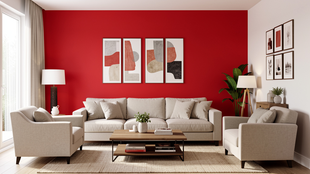
Living Room: The Heart of Connection
As a primary gathering space, your living room benefits from a bold color that fosters warmth without overwhelming daily life. Avoid hues that feel aggressive (neon brights) or isolating (very dark, cool tones in low-light rooms).
Key Considerations:
– Traffic flow: Bold color on a single accent wall behind the main seating area creates a focal point without dominating circulation paths.
– Light assessment: South-facing rooms often harmonize with deep, saturated colors (rich teals, warm rusts). North-facing rooms may benefit from bold colors with warm undertones (ochre, terracotta, mustard) to counteract cool light.
– Scale matters: In open-concept layouts, use bold color to define zones. Paint the wall behind the sofa a deep olive to distinguish the living area from adjacent spaces.
– Furniture harmony: If your sofa is neutral (gray, beige), bold walls provide dynamic contrast. If furniture is colorful, choose a bold wall color sharing an undertone (e.g., a warm brick red wall complements burnt orange accents).
Pro Technique: The “Conversation Wall”
Identify the wall where people naturally face during gatherings (often opposite the main seating). Apply your boldest choice here. During testing, sit in your primary seating position at different times of day. Does the color feel engaging? Does it enhance connection? A warm terracotta here can make conversations feel more intimate; a deep sage promotes calm discussion.
Common Pitfall & Fix:
Pitfall: Bold color clashing with large artwork or a statement rug.
Fix: During Layer 1 testing, place key art pieces near your sample board. If conflict arises, consider repainting the wall around the art (creating a “frame”) in your bold color, leaving the art wall neutral.
Real Application: The Rivera family loved deep emerald green but worried it would darken their medium-sized living room. They applied it only to the fireplace wall (a natural focal point), kept other walls a warm white, and added brass accents. The green felt luxurious without closing in the space. Evening lighting made the green glow, enhancing cozy ambiance.
Bedroom: Sanctuary Over Statement
Bedrooms benefit from colors that support rest. Bold doesn’t mean jarring. Prioritize hues with calming associations: deep blues, forest greens, muted plums, or warm clay tones. Avoid high-energy reds, oranges, or bright yellows directly on large wall surfaces.
Key Considerations:
– Ceiling potential: A soft charcoal or deep navy ceiling creates a “cocooning” effect. Test samples while lying in bed.
– Accent strategy: Apply bold color to the wall behind the headboard. This creates a grounded backdrop for rest. Keep remaining walls lighter neutrals.
– Lighting synergy: Bedside lamps with warm bulbs (2700K) soften bold colors beautifully. Avoid cool-white overhead lights, which can make deep colors feel clinical.
– Textile integration: Layer bedding and curtains in complementary tones. A deep teal wall pairs elegantly with cream linens and walnut wood tones.
Pro Technique: The “Wind-Down Gradient”
Create visual calm with a gradient approach:
– Wall behind headboard: Deepest shade
– Adjacent walls: Medium tone
– Opposite wall/ceiling: Lightest tone
This guides the eye gently and prevents visual “noise.” Test all samples together during your audit.
Common Pitfall & Fix:
Pitfall: A bold color that feels energizing at noon but heavy at bedtime.
Fix: During Layer 2 testing, observe the sample in bed with only bedside lamps on. If it feels oppressive, choose a slightly lighter value or shift to a warmer undertone.
Real Application: David chose a deep slate blue for his bedroom accent wall. During evening testing, he noticed it felt serene with warm bedside lamps but cold under overhead light. Solution: He installed dimmable sconces flanking the bed and minimized overhead use. The blue now evokes a tranquil twilight sky.
Kitchen: Energy with Balance
Kitchens are high-activity zones where color influences mood during meal prep and gathering. Bold colors here should energize without causing visual fatigue. Warm, earthy tones (ochre, olive green, brick red) often work well. Avoid cool, sterile bolds (electric blue, stark magenta) that can feel clinical.
Key Considerations:
– Cabinet strategy: Painting lower cabinets a bold color (navy, forest green) grounds the space; uppers in white keep it airy. Full bold cabinets require exceptional lighting and confidence—test extensively.
– Backsplash synergy: If keeping a neutral backsplash, a bold wall color behind it creates depth. Ensure the color complements countertop undertones.
– Appliance integration: Stainless steel appliances reflect surrounding colors. A warm terracotta wall casts a golden glow; a cool charcoal may shift reflections. Test samples near appliances.
– Small kitchen hack: In galley kitchens, paint the end wall (opposite the entrance) a bold color. This creates an illusion of depth.
Pro Technique: The “Work Triangle Test”
Map your kitchen’s work triangle (sink, stove, fridge). During testing, stand at each point while observing your color sample. Does the color feel supportive while chopping? Calming while washing dishes? If it feels stressful at any station, reconsider.
Common Pitfall & Fix:
Pitfall: Bold color clashing with fixed elements like granite countertops.
Fix: Pull a dominant undertone from the countertop (e.g., if veins are rust-colored, choose a warm terracotta wall). During Layer 1, place countertop samples next to paint chips under kitchen lighting.
Real Application: Maya’s kitchen had warm honey-oak cabinets and golden granite. She tested a cool gray-blue wall color—it made the wood look orange. Switching to a warm olive green harmonized all elements, enriching wood tones and creating cohesion.
Bathroom: Drama in Miniature
Powder rooms and primary bathrooms are ideal bold color laboratories. Their small size contains intensity, transforming functional spaces into memorable experiences. Deep hues (navy, charcoal, forest green, plum) feel luxurious and spa-like. Avoid colors that distort skin tones (certain pinks, yellows) near mirrors.
Key Considerations:
– Moisture matters: Use paint with a satin or semi-gloss finish for humidity resistance and easy cleaning. Verify product suitability for bathrooms.
– Mirror placement: Avoid painting the wall directly behind a large mirror a bold color—it can create a disorienting effect. Instead, paint side walls or the wall opposite the mirror.
– Tile interaction: Bold wall color should complement, not compete with, tile. If tile has pattern/color, choose a wall color pulled from the tile’s palette. For white subway tile, most bold colors work well.
– Ventilation check: Ensure exhaust fan is functional. High humidity affects paint curing—follow manufacturer’s recoat times precisely.
Pro Technique: The “Spa Immersion”
For primary bathrooms, paint all walls and the ceiling the same deep, calming color. This creates a seamless sanctuary. Test samples on both wall and ceiling surfaces—ceiling color reads differently due to light reflection. Pair with warm wood tones, brass fixtures, and ample soft lighting.
Common Pitfall & Fix:
Pitfall: Bold color making a small bathroom feel smaller.
Fix: Use satin or semi-gloss paint on trim to reflect light. Install sconces flanking the mirror (not overhead) to eliminate facial shadows. Choose a bold color with subtle warmth.
Real Application: The Chen family transformed their beige powder room with a vibrant red. They painted all four walls and the ceiling, added black hexagon tile flooring, and gold fixtures. The uniform color eliminated visual breaks, making the small space feel intentional, dramatic, and surprisingly spacious.
Home Office: Focus Without Fatigue
Your workspace color should support concentration without causing eye strain. Bold colors work best as accents rather than full-wall coverage. Deep greens (associated with focus), warm blues (calm clarity), or muted terracottas (grounded energy) are thoughtful choices.
Key Considerations:
– Screen glare: Avoid highly saturated colors directly opposite your monitor—they may cause visual fatigue or reflect on screens. Place bold color on the wall behind you or to the side.
– Task lighting: Ensure your desk lamp provides focused, warm light. Test your color sample under this specific light source.
– Psychological trigger: Use bold color intentionally to signal “work mode.” Painting the wall behind your desk a deep charcoal can create a mental boundary in a multi-use room.
– Size adjustment: In very small offices (<100 sq ft), limit bold color to one accent wall or use it on built-in shelving interiors.
Pro Technique: The “Focus Frame”
Paint only the wall section directly behind your desk (from floor to 6 inches above monitor height) in your bold color. Frame it with neutral paint above and below. This creates a dedicated “focus zone.” During testing, sit at your desk for 20 minutes observing the sample—does it feel supportive or distracting?
Common Pitfall & Fix:
Pitfall: A bold color that feels stimulating initially but becomes agitating after hours.
Fix: Choose a bold color with lower saturation (muted sage vs. lime green) or add significant neutral elements (light wood desk, white shelves). Layer in plants—the biophilic connection softens bold color intensity.
Real Application: Lena needed focus for writing but found white walls sterile. She painted the wall behind her desk a deep, muted green. During her 72-hour test, it felt calming during morning sessions and didn’t drain energy by afternoon. She added an abstract painting with complementary rust tones to prevent monotony.
Entryway & Hallway: The First Impression Engine
These transitional spaces set the tone for your entire home. Bold color here creates immediate personality and guides movement. Deep, welcoming hues (burgundy, forest green, charcoal) work exceptionally well. Avoid colors that feel cold or unwelcoming (icy blues, stark blacks).
Key Considerations:
– Flow continuity: Ensure the entryway color harmonizes with the first room guests enter. Pull a secondary color from that room’s palette.
– Light reality: Entryways often lack windows. Test samples under your actual artificial lighting for multiple evenings. A color that looks warm in daylight may feel flat under cool LEDs.
– Scale illusion: In narrow hallways, paint the end wall (opposite the entrance) a bold color to create depth. Paint side walls a lighter coordinating shade.
– Durability: Use scrubbable paint (satin or semi-gloss) in high-traffic entryways.
Pro Technique: The “Welcome Threshold”
Paint the entryway ceiling the same bold color as the walls. This “enveloping” technique feels intentional, especially in spaces with architectural details. Test a sample on the ceiling—view it while opening the front door. Does it feel inviting?
Common Pitfall & Fix:
Pitfall: Bold color making a small entryway feel cramped.
Fix: Use satin or semi-gloss paint on trim to reflect light. Install a mirror opposite the bold wall to amplify space. Choose a bold color with warmth (e.g., charcoal with brown undertone).
Real Application: The Parkers’ narrow entryway felt like a tunnel. They painted the end wall a deep teal and the side walls a light warm gray. The teal wall drew the eye forward, creating perceived depth. A large mirror opposite amplified light and space. Guests consistently comment on the “surprisingly spacious” feel.
Dining Room: Cultivating Connection
Dining rooms thrive on colors that support appetite and conversation while fostering intimacy. Warm, earthy bolds are ideal: terracotta, ochre, deep reds (burgundy), olive green. Avoid cool, appetite-suppressing hues (gray-blues, purples) on large surfaces.
Key Considerations:
– Table centrality: The wall behind the main dining table is the prime accent location. Test samples while seated at the table—view the color at eye level during a “meal.”
– Lighting synergy: Dimmable warm-white bulbs (2700K) are essential. Observe your sample under this lighting during testing. Candlelight will further warm the color.
– Art integration: If displaying large artwork, ensure the bold wall color doesn’t compete. A deep neutral (charcoal, chocolate brown) often serves as a better backdrop for colorful art.
– Adjacent rooms: Consider sightlines. If the dining room opens to a living room with cool tones, choose a bold dining color with subtle warmth to bridge spaces.
Pro Technique: The “Conversation Circle”
Paint all four walls the same bold color to create an intimate, cocooning effect ideal for gatherings. During testing, sit at the table with others. Does the color feel energizing for conversation? Does it enhance the dining experience? Pair with warm wood tones and textured textiles to prevent formality.
Common Pitfall & Fix:
Pitfall: Bold color casting unflattering shadows on faces during meals.
Fix: Layer lighting: overhead dimmable fixture + wall sconces + candles. During testing, observe faces under this layered lighting with the sample present. Adjust bulb temperature or add sconces if shadows persist.
Real Application: Maria chose a warm terracotta for her dining room. During evening testing with layered lighting, it created a flattering, golden glow on skin tones and made food look more appetizing. The color felt festive yet grounded, perfectly setting the mood for family gatherings.
Small Spaces & Unexpected Surfaces: Low-Risk High-Reward Zones
Bold color shines where commitment feels manageable. These areas build confidence and deliver outsized impact.
Closets: Paint the interior of a walk-in closet a joyful bold color (sunny yellow, powder blue). Transforms a utilitarian space into a daily delight. Use scrubbable paint. Test samples inside the closet with the door closed—lighting is unique.
Stair Risers: Paint the vertical face of each stair step a bold color. Creates rhythm and surprise. Test durability—use porch-and-floor paint for high traffic.
Bookshelf Interiors: Paint the back panel of built-in shelves a deep hue (navy, emerald). Makes displayed objects “pop” and adds depth. Removable wallpaper works well here too.
Ceiling Medallions: In rooms with crown molding, paint ceiling medallions or coffered ceiling insets a bold accent color. Draws the eye upward, adding architectural interest.
Front Door (Interior): Paint the inside of your front door a bold color visible when closed. A private “hello” or “goodbye” moment. Coordinate with exterior if visible through glass.
Pro Tip for Renters: Removable wallpaper is highly effective. High-quality vinyl options mimic paint texture and come in bold solids and patterns. Apply to an accent wall, closet interior, or bookshelf back. Always test adhesion on a small, hidden area first and follow removal instructions precisely. Document the room’s original condition before applying.
Navigating Common Frictions: When Bold Color Feels Risky
Even with a solid framework, doubts arise. This section addresses persistent barriers with evidence-based reassurance and actionable solutions. These concerns are universal. Acknowledging them is the first step to moving through them.
“What if I hate it after painting the whole room?”
This fear of regret is common. The Confidence Framework is designed specifically to prevent this outcome. Layer 2 (Physical Testing) is your validation phase. If you completed the 72-hour light audit with large samples, observed the color in context, and passed the “Walk-Away Test,” the likelihood of post-paint regret diminishes significantly. Experience from paint professionals suggests that insufficient testing is frequently linked to color dissatisfaction. Trust your documented process. If anxiety persists after thorough testing, it may reflect fear of change rather than the color itself. Implement the “24-Hour Cooling Period” before purchasing gallons: sleep on your final sample decision. If excitement remains, proceed. If doubt lingers, revisit Layer 1—does this color truly align with your room’s intention?
“My partner/family/household isn’t on board.”
Color choices can become emotional flashpoints. Approach collaboratively:
– Frame it as shared observation: “Let’s test this sample for three days with no commitment. We’ll both note our reactions.” Shared observation depersonalizes the decision.
– Find common ground: Use the Color Context File from Layer 1. Identify non-negotiable elements everyone appreciates (e.g., “We both love the warmth of the wood floors”). Choose a bold color that enhances those elements.
– Start small: Propose a low-risk application first—a closet interior, a single accent wall in a less-trafficked room. Success here builds trust.
– Visualize together: During testing, sit in the room at different times and discuss observations neutrally: “How does this feel at 8 AM?” not “Don’t you love this?”
Collaborative testing approaches are widely reported to improve long-term satisfaction with bold color choices.
“Bold color will make my small room feel smaller.”
This is a nuanced concern. While light, cool colors can recede visually, bold color used intentionally creates intimacy and perceived depth. In a small room:
– Dark colors absorb light, reducing visual “noise” from walls and making the space feel contained and cozy (like a luxurious boutique hotel room).
– Strategic placement is key: Paint the wall opposite the door a bold color to draw the eye inward, creating depth. Avoid painting all four walls a very dark, cool color without adequate lighting.
– Lighting is essential: Layer warm, dimmable lighting. A small room with deep teal walls and three light sources (overhead, floor lamp, sconce) will feel expansive and inviting; the same room with one cool overhead light may feel cave-like.
Design publications frequently showcase small spaces using deep colors successfully—always paired with thoughtful lighting and reflective surfaces (mirrors, glass tables).
“It’s too expensive to make a mistake.”
This is valid. Paint represents an investment. The framework minimizes financial risk:
– Sample investment: Spending $15 on three sample pots and foam core boards is minimal compared to the cost of repainting. Treat samples as essential research.
– Start with one wall: Commit to painting only your chosen accent wall first. Live with it for a week. If it works, proceed. If not, you’ve limited cost and effort.
– Paint stewardship: Many communities have paint exchange or recycling programs. Unused paint can often be donated responsibly.
– Professional consultation: For modest investment, a certified color consultant can validate your choice—potentially preventing larger expenses. Consider it targeted guidance.
Thorough sampling is consistently cited as a cost-effective step that prevents repaint expenses.
“I’m renting—can I even do this?”
Absolutely—with strategy and landlord communication.
– Removable wallpaper: High-quality vinyl options offer bold solids and patterns. Test adhesion in a closet first. Remove slowly with a hairdryer on low heat.
– Peel-and-stick panels: For accent walls with texture or geometric designs.
– Bold textiles: Area rugs, curtains, slipcovers, and large artwork deliver major color impact with zero permanence.
– Landlord dialogue: Frame it positively: “I’d like to add a removable accent wall to personalize the space. It will protect the underlying paint and can be removed cleanly before I move out.” Offer product details and removal instructions. Many landlords appreciate tenants who care for the property.
– Document everything: Take timestamped photos of walls before applying any product. Keep removal instructions and receipts.
Renters report high success rates with removable solutions when approached respectfully and preparedly.
“What if the color looks different on the wall than the sample?”
This is why Layer 2 exists. But if discrepancies occur post-application:
– Lighting adjustment: Change bulb temperature (warmer 2700K bulbs often soften bold colors beautifully). Add layered light sources.
– Neutral anchors: Introduce more neutral textiles (rugs, curtains, large furniture) to balance intensity.
– Strategic editing: Paint trim or an adjacent wall a coordinating neutral to reduce perceived saturation.
– Adjustment period: It can take days or weeks for your eyes to adjust to a new bold color. Live with it before deciding to repaint. Initial reactions often soften into appreciation.
– Professional perspective: If truly unworkable, consult a painter about transition options.
Remember: Minor variations are normal. Focus on whether the color functions well in the space (supports your intention, feels good at key times) rather than matching a sample chip exactly.
Your Questions, Answered
Q: How do I choose between two bold colors I love equally?
A: Return to Layer 1 of the Confidence Framework. Which color better supports your room’s primary emotional goal and function? Conduct a side-by-side 72-hour light audit with both samples mounted. Keep a simple journal: “Color A feels energizing at noon but harsh under evening lights. Color B feels consistently warm and inviting.” The color that aligns most consistently with your documented intention is the right choice. If still tied, warmer undertones often offer greater adaptability across lighting conditions.
Q: Can I use bold color in a room with very little natural light?
A: Yes—with strategy. Avoid cool, dark bolds (navy, charcoal) which may feel heavy. Instead, choose bold colors with warm undertones: terracotta, ochre, mustard yellow, warm brick red, or deep olive green. These hues interact more warmly with available light. Pair with satin or eggshell finishes to gently reflect light. Layer multiple warm-light sources (2700K bulbs): overhead dimmable fixture, floor lamp, wall sconces. During testing, observe samples under only your artificial lighting for several evenings. If the color feels flat, shift to a slightly lighter value of the same hue.
Q: How do I pair bold wall color with existing colorful furniture or art?
A: Identify the dominant undertone in your existing pieces. Pull a paint chip that shares that undertone but differs significantly in value (lightness/darkness). For example, if your sofa has warm rust tones, choose a deep terracotta wall (darker value) or a soft peach (lighter value) rather than a competing mid-tone. During Layer 2 testing, place the furniture or art photo directly next to your sample board. Step back 10 feet—do they harmonize? When in doubt, let the boldest element be the focal point, and ensure other colorful items share at least one undertone. Neutral large furniture provides essential visual breathing room.
Q: What finish (sheen) should I use for bold colors?
A: Finish impacts both aesthetics and function. For most walls with bold color:
– Eggshell: Ideal balance. Slight sheen hides minor imperfections better than flat, is more washable, and doesn’t reflect light harshly. Best for living rooms, bedrooms, dining rooms.
– Satin: Higher durability and washability. Recommended for high-traffic areas (hallways, playrooms), kitchens, and bathrooms. Reflects more light—test thoroughly to ensure it doesn’t create glare.
– Avoid flat/matte for bold colors on large walls—it shows every imperfection and is difficult to clean. Reserve for ceilings.
– Avoid high-gloss on large wall surfaces—it magnifies flaws and can feel institutional. Use only for trim, doors, or furniture accents.
Always test your chosen finish alongside the color during Layer 2. A satin finish will make a color appear slightly richer than eggshell.
Q: How do I fix a bold color that looks wrong only at night under artificial light?
A: This is often a lighting issue. First, assess your bulbs:
– Switch to warm white (2700K–3000K) LEDs. Cool white bulbs (3500K+) can distort warm bold colors.
– Layer light sources. A single overhead light creates harsh shadows. Add floor lamps, table lamps, or wall sconces to diffuse light evenly across the colored wall.
– Install dimmers. Lowering light intensity often softens bold colors beautifully in the evening.
If adjustments don’t resolve it, the color may have undertones clashing with your bulbs. During future testing, prioritize evening observations under your actual lighting. For current walls, introduce more warm-toned textiles (rust throw pillows, ochre rug) to shift the room’s overall temperature.
Q: Is there a “safe” bold color that works in almost any room?
A: While no color is universally perfect, deep, warm neutrals offer bold impact with high adaptability:
– Warm Charcoal: Has brown/taupe undertones, not blue. Works with both warm and cool decors.
– Earthier Greens: Muted sage tones feel organic and calming.
– Clay/Terracotta: Warm, grounding, and harmonizes with wood tones.
These colors provide depth and personality while remaining versatile. However, “safe” is relative—always validate with your specific room’s light and context using Layer 2 testing. What works in one home may not in another.
Q: How many bold colors can I use in one room?
A: For most spaces, adapt the 60-30-10 principle:
– 60% Dominant neutral (flooring, large furniture)
– 30% Secondary color (could be your bold wall color)
– 10% Accent color (textiles, art, accessories)
Using two bold colors risks visual tension unless carefully curated:
– Monochromatic scheme: Different values of the same hue (e.g., deep navy wall with medium blue curtains).
– Analogous scheme: Colors adjacent on the color wheel (e.g., terracotta wall with ochre accents).
– Complementary scheme (advanced): Opposite colors (e.g., deep green wall with rust accents)—use one bold color dominant, the other strictly as accent.
When starting out, limit bold color to one primary surface per room. Master that before layering multiple bolds.
Q: What if my bold color looks perfect during testing but wrong after full application?
A: This is uncommon with rigorous Layer 2 testing but can occur due to scale (color feels more intense covering 100 sq ft vs. a sample) or unanticipated light reflections. First, allow 72 hours—your eyes need adjustment time. Then:
– Reassess under multiple lighting conditions. Is it always wrong, or only at certain times?
– Introduce neutral elements: Add a large cream rug, white curtains, or light wood furniture to balance intensity.
– Edit strategically: Paint one wall a coordinating neutral. Often, reducing bold coverage to an accent wall resolves the issue.
– Seek perspective: A fresh set of eyes (friend, designer) can offer objective insight.
Remember: Paint is adaptable. Viewing it as a flexible medium reduces pressure.
Q: How do I maintain bold-colored walls long-term?
A: Bold colors may show scuffs more readily. Prevention and care are key:
– Use scrubbable paint: Satin or eggshell finishes clean easier than flat.
– Touch-up kit: Keep leftover paint (stored properly in a cool, dark place) and a small roller/brush for immediate spot repairs.
– Cleaning: For marks, use a soft cloth with mild soap and water. Test in an inconspicuous area first. Avoid abrasive cleaners.
– Furniture pads: Attach felt pads to chair backs and table edges to prevent scuffs.
– Refresh awareness: Bold colors in direct sunlight may show fading over time. Plan to refresh high-sun areas as needed. Keep paint records (brand, color name, lot number) for accurate matching.
Q: Are there rooms where I should absolutely avoid bold color?
A: Exercise thoughtful consideration in:
– Nurseries: Very young children often benefit from calmer environments. Save bold color for accent pieces (art, rug) until age 3+.
– Home theaters: Dark, non-reflective colors (deep gray, charcoal) are ideal for reducing screen glare. Avoid saturated brights that reflect light.
– Rooms with severe lighting challenges: Spaces with only one small north window and cool artificial lighting may require extra care. If attempting bold color, choose warm-toned options and invest heavily in layered warm lighting.
When in doubt, start with a low-risk application (closet, accent wall) in that room type before committing fully.
Q: How do cultural or regional preferences affect bold color choices?
A: Color perception is influenced by cultural context and climate. In sun-drenched regions, bold warm colors (ochre, terracotta, deep blue) often feel harmonious with the landscape. In cooler, cloudier climates, earthy bolds (forest green, warm charcoal) may resonate more. However, personal intention matters most. Use Layer 1 to define your emotional goal for the space. If a vibrant coral brings you joy in a gray-climate home, validate it thoroughly through Layer 2 testing under your specific lighting. Your home should reflect your story. When selecting, consider how the color interacts with your local light quality (soft/diffuse vs. sharp/direct) during testing.
Q: How does seasonal change affect bold color perception?
A: Natural light shifts dramatically across seasons—winter light is cooler and lower-angle; summer light is brighter and warmer. During Layer 2 testing, note the season. If testing in winter, consciously consider how brighter summer light might alter the color’s appearance (often making it appear lighter and more vibrant). For spaces used year-round, prioritize testing under your most common lighting conditions. In regions with extreme seasonal light variation, lean toward bold colors with versatile undertones (earthy greens, warm charcoals) that adapt well across light conditions. Document seasonal observations in your Color Context File for future reference.
Conclusion: Your Journey to Color Confidence
You now hold a complete system for embracing bold color with clarity. This isn’t about rigid rules—it’s about cultivating a mindful process that transforms uncertainty into agency. Let’s crystallize the core principles:
1. Intention precedes pigment. Your room’s purpose and emotional goals guide every decision.
2. Evidence over impulse. The 72-hour physical testing protocol is your most reliable tool for alignment. Trust documented observation.
3. Strategy enables expression. From placement to flexibility, thoughtful execution turns bold choices into lasting harmony.
The 24-Hour Rule: Your Final Safety Net
Before purchasing gallons of paint, implement this non-negotiable step: After completing Layer 2 testing and selecting your final color, wait exactly 24 hours. Do not look at the sample. Live your normal life. At the end of 24 hours, revisit the sample. Does your conviction feel stronger? Calmer? More certain? This cooling period filters out novelty bias and confirms genuine resonance. If doubt emerges, pause. Revisit your Color Context File. If certainty remains, proceed with confidence. This small pause prevents significant regret.
The Big Picture: Color as a Living Element
Your relationship with color will evolve. A bold hue that energizes you today may feel different in five years—and that’s natural. Design is not static. The Confidence Framework empowers you to adapt: when the time comes, you’ll test new options with the same rigor. More importantly, bold color application is a practice in self-trust. Each validated choice strengthens your design intuition. You learn to listen to your space, honor your needs, and express your uniqueness without apology. That confidence extends far beyond paint—it reshapes how you engage with your environment and your decisions.
You are not merely painting a wall. You are curating an experience. You are crafting a backdrop for memories, conversations, rest, and creativity. A thoughtfully chosen bold color doesn’t just change a room; it changes how you feel within it. It affirms that this space is yours—intentional, authentic, and alive. Take a breath. Trust your process. Pick up that sample pot. Your fearless color journey begins now.
Explore Our Complete Color Confidence System:
The Psychology of Color in Home Design: Choosing Hues That Support Your Well-Being | Mastering Light: How to Assess and Enhance Natural & Artificial Lighting in Every Room | The Neutral Palette Decoded: Finding Your Perfect Foundation Shade Beyond “Beige” | Texture as Color: Using Materials, Fabrics, and Finishes to Add Depth Without Paint | The Sustainable Painter’s Guide: Eco-Friendly Paints, Low-Waste Techniques, and Long-Term Care | Renters’ Revolution: High-Impact, Zero-Commitment Design Strategies for Any Space | Color Correction Clinic: Diagnosing and Fixing Common Painting Mistakes with Grace